
REICO-HU
(E-commerce Platform)
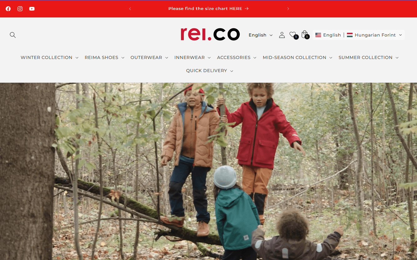
Reico is an online store for children’s clothing with a season-based assortment. The platform helps parents quickly find weather-appropriate items through clear structure, size logic, and simple shopping flows.
Context
Seasonal e-commerce platform for children’s clothing, focused on helping parents quickly choose the right items for changing weather and growth stages.
My role
Product Designer
Team
Product Manager
Shopify Developer
Timeline
May 2023 – May 2024 (12 Months)
As the Product Designer on the Reico team, I…
- Researched parents’ buying behavior and decision-making patterns
- Defined information architecture for seasonal assortments
- Built a scalable design system for product cards and layouts
- Collaborated with development to implement solutions on Shopify
- Iterated on guidance features such as sizing, recommendations, and stock indicators
Goal
OBJECTIVE
Design a clear and intuitive e-commerce experience for seasonal children’s clothing, enabling parents to quickly find the right items throughout the year.
APPROACH
Focused on simple shopping flows, adaptable structure for seasonal changes, and consistent UX across devices.

SOLUTIONS
PROBLEM
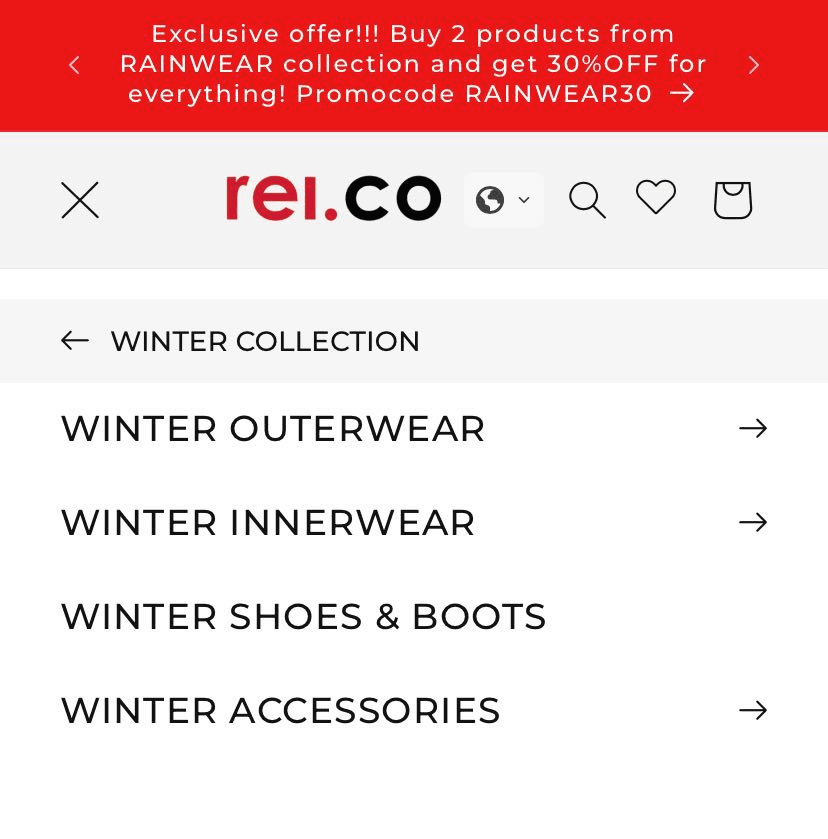
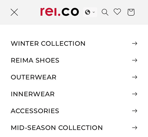
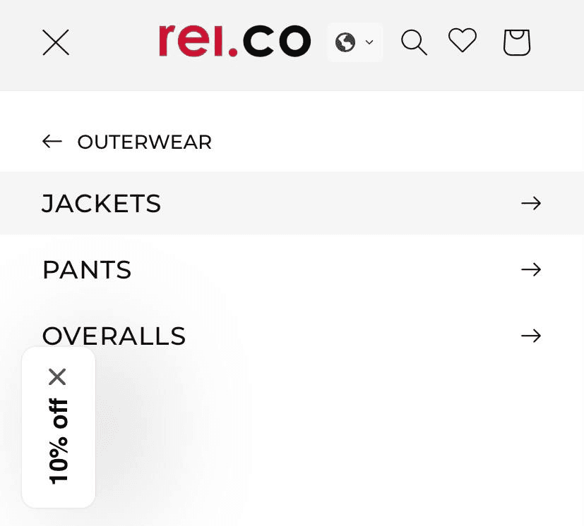
Seasonal relevance and key clothing features were not clearly structured, making comparison and product selection difficult.
SOLUTION
Designed a season-based navigation system that organizes collections by weather relevance and highlights key functional attributes, helping users browse faster and choose more confidently.
IMPACT
Users reached relevant seasonal products with fewer category switches.
Navigation paths became more direct, with less backtracking between collections.
Key functional features (e.g. weather suitability, insulation) were identified earlier in the browsing flow.
Users compared products within the same seasonal context instead of jumping across categories.
METHOD
Navigation and category structure testing on interactive prototypes.
Evaluated how users explored seasonal collections, compared products, and identified functional features during browsing tasks.
Collected navigation paths, task completion observations, and qualitative feedback.
PROBLEM
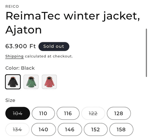
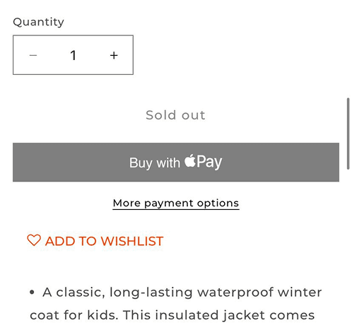
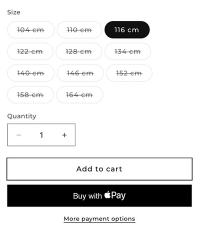
Product details and seasonal relevance were fragmented across the page, making it difficult to evaluate performance, compare items, and choose the correct size.
SOLUTION
Reorganized the product page to surface seasonal purpose, key functional features, and sizing guidance upfront.
This allowed users to evaluate suitability and make size decisions earlier, without excessive scrolling or context switching.


IMPACT
Users identified relevant product features earlier in the page flow.
Time to size selection was reduced during testing sessions.
Size chart interactions became more intentional, with fewer repeated open–close cycles.
Users evaluated product suitability with less back-and-forth between gallery, specs, and sizing sections.
METHOD
Product page usability testing focused on decision-making and size selection.
Participants completed product evaluation tasks using interactive prototypes.
Observed navigation behavior, time to size selection, interaction with size charts, and qualitative feedback.
PROBLEM
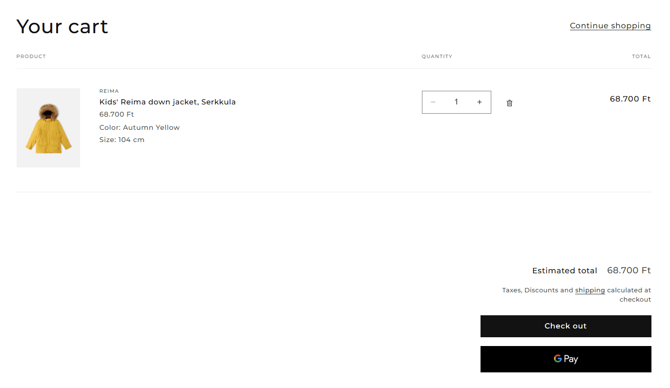
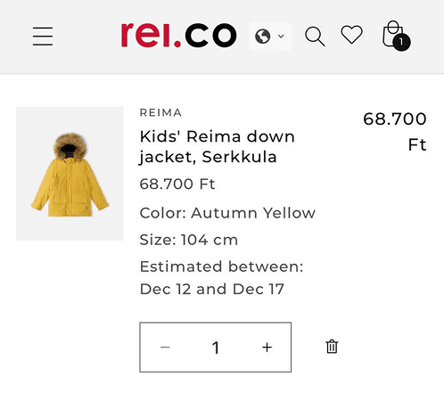
Users lacked a clear way to review order details and critical purchase information at the cart stage, increasing uncertainty and hesitation before checkout.
SOLUTION
Redesigned the cart to clearly surface selected item details, size, color, quantity, and total price for quick verification.
Added a centralized “Important to know” section that groups shipping, returns, sizing, and payment information into expandable panels, keeping users focused and informed before checkout.
IMPACT
Users reviewed order details more quickly with fewer returns to the product page.
Hesitation before proceeding to checkout was reduced during testing sessions.
Purchase-related information was accessed directly from the cart instead of triggering additional navigation.
Users reported greater confidence when confirming their order before checkout.
METHOD
Cart and pre-checkout usability testing on interactive prototypes.
Observed how users reviewed order details, accessed purchase information, and proceeded to checkout.
Measured hesitation points, backtracking to product pages, interaction with informational sections, and qualitative feedback.
PROBLEM
Users lacked a clear way to review order details and critical purchase information at the cart stage, increasing uncertainty and hesitation before checkout.
SOLUTION
Redesigned the cart to clearly surface selected item details, size, color, quantity, and total price for quick verification.
Added a centralized “Important to know” section that groups shipping, returns, sizing, and payment information into expandable panels, keeping users focused and informed before checkout.

IMPACT
Users lacked a clear way to review order details and critical purchase information at the cart stage, increasing uncertainty and hesitation before checkout.
METHOD
Redesigned the cart to clearly surface selected item details, size, color, quantity, and total price for quick verification.
Added a centralized “Important to know” section that groups shipping, returns, sizing, and payment information into expandable panels, keeping users focused and informed before checkout.
Reflection
This project focused on designing clarity and confidence within a constantly changing seasonal e-commerce environment.

Designing for Seasonal Change
Built flexible navigation and layout patterns that adapt to seasonal assortment updates without breaking consistency.
Communicating Technical Details
Translated complex clothing features into simple, scannable product information.
Supporting Confident Decisions
Structured information and micro-interactions to reduce hesitation and support fast, informed choices.
Working Within Platform Constraints
Designed scalable UI patterns that fit Shopify’s structural limits while maintaining clarity and cohesion.